When you are ready to install Quform Styles, you must first upload the plugin files and then activate the plugin itself. The plugin files can be uploaded in two ways:
FTP Upload: Using your FTP program (we recommend Filezilla), upload the unzipped plugin folder into the “../wp-content/plugins/” folder on your server.
WordPress Upload: Navigate to Appearance » Plugins » Add New » Upload. Go to browse, and select the zipped plugin folder. Hit “Install Now” and the plugin will be uploaded and installed.
Once the plugin has been uploaded, you need to activate it. Go to Plugins » Installed Plugins and activate Quform Styles.
You can install our demo settings which will ensure that your form uses the same colors and fonts as on our demo. To install the demo setting, please follow these steps:
With the Quform plugin activated, go to Quform Styles in the main menu in the WordPress backend.
In the Quform Styles options panel, go to Import / Export, located at the bottom.
Under the Import / Export option, click on the button that says Import From URL
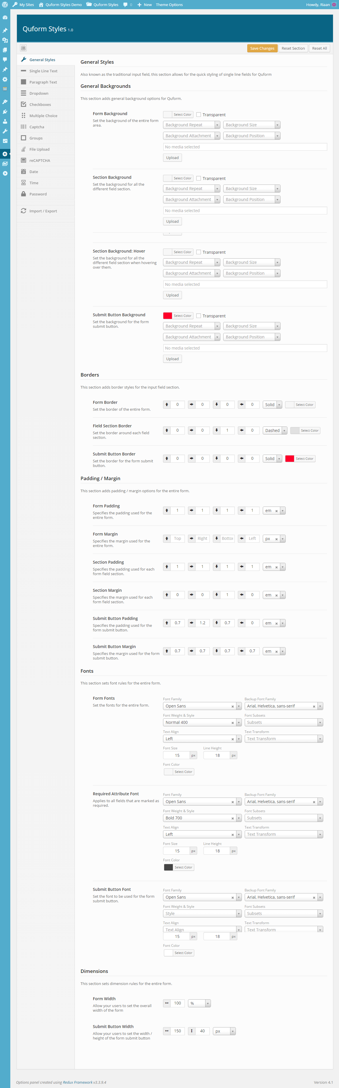
General settings deals with the overall view your form, whereas the subsequent parts deal with each input field specifically. With the general settings field, you are able to change the following sections of Quform:
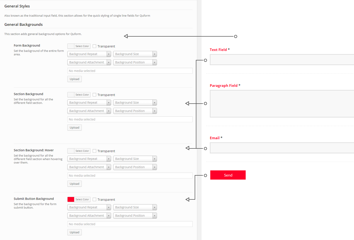
Backgrounds
Form Background
Section / Section Hover Backgrounds
Submit Button Background
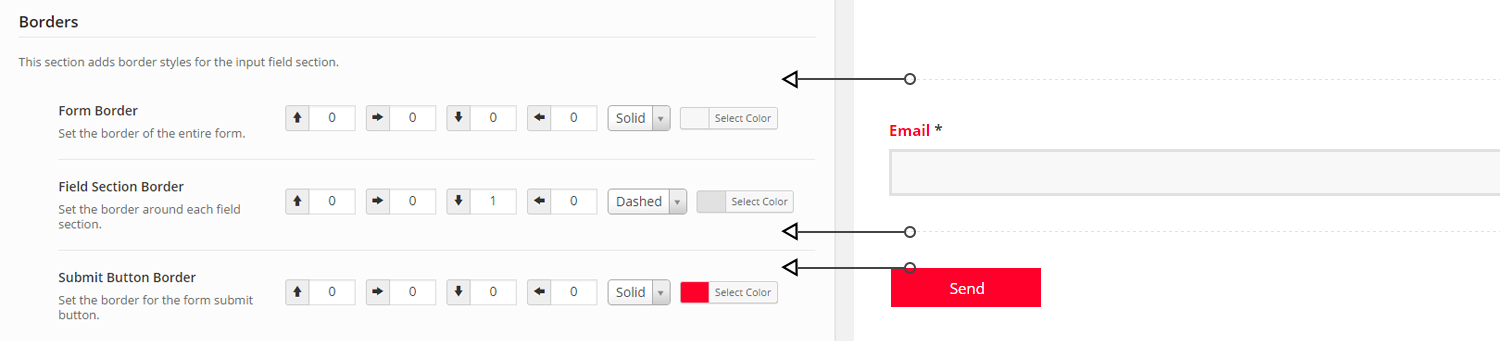
Borders
Overall Form Borders
Section Borders
Submit Button Borders
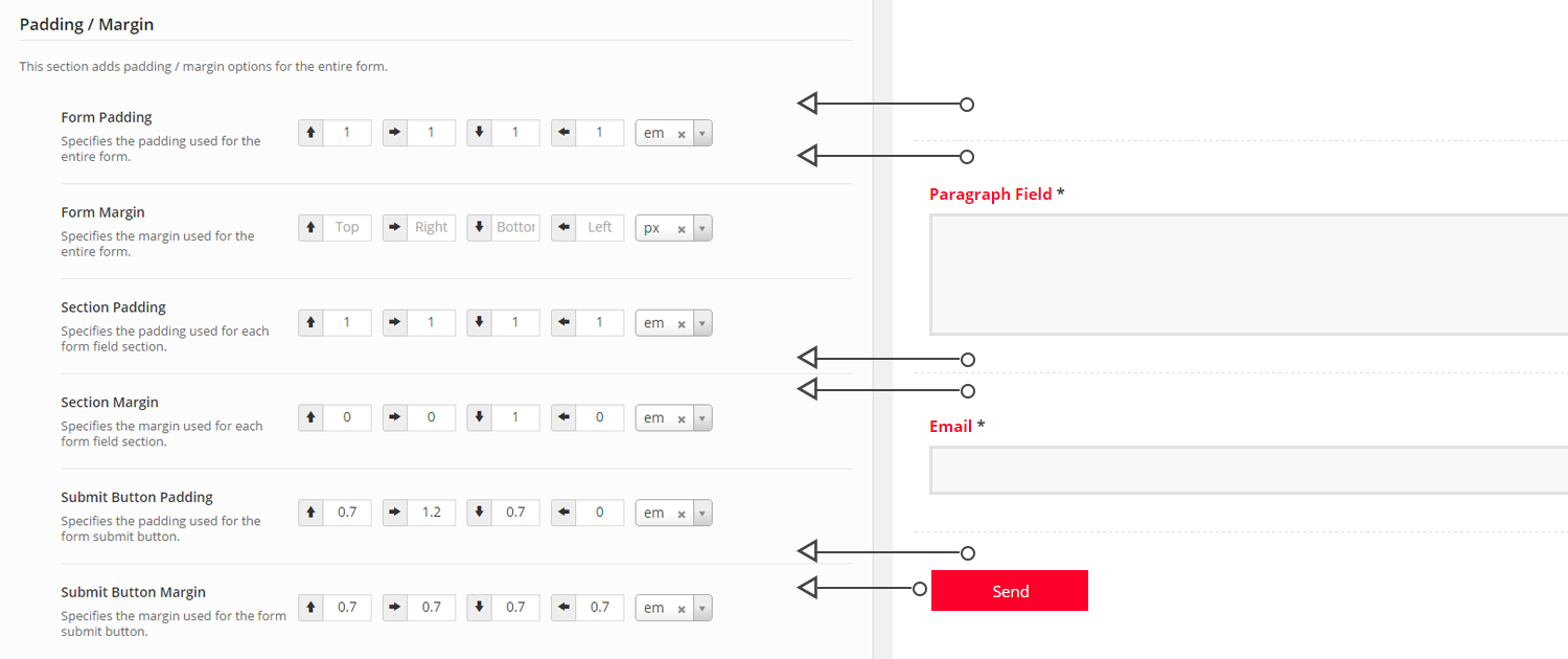
Padding / Margin
Overall Form Padding / Margin
Section Padding / Margin
Submit Button Padding / Margin
General Settings: A Detailed Look at What is Possible
General Settings: Padding / Margin
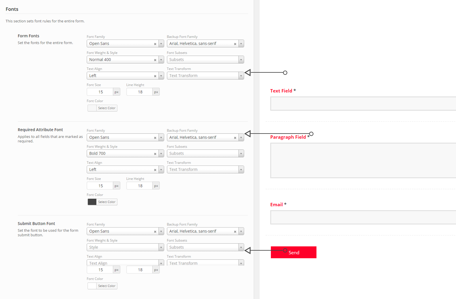
General Settings: Fonts
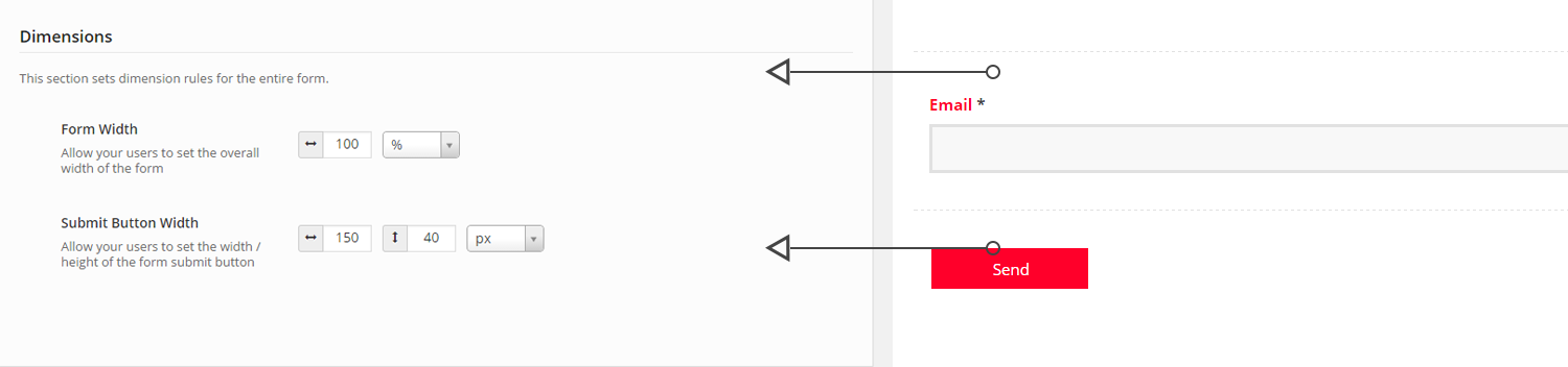
General Settings: Dimensions
General Settings: Borders
General Settings: Backgrounds
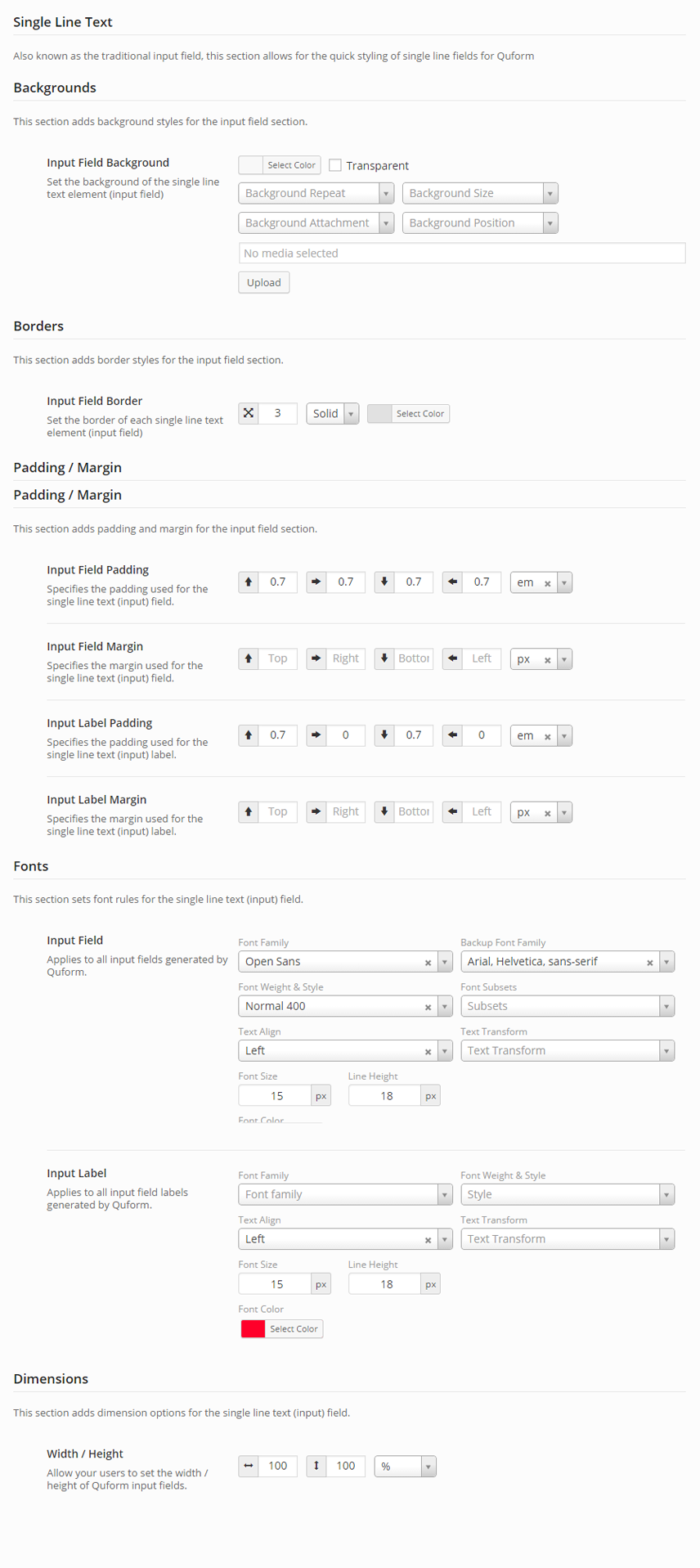
Single Line Text Settings
The Single Line Text field (traditionally known as the input field) is one of the most universally recognised input fields used in forms today. With Quform styles, you’re able to change the look & feel of your Quform input field. With Quform Styles, the following can be changed on your Single Line Text field:
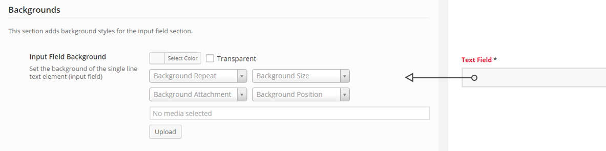
Backgrounds
Input Field Margin
Border
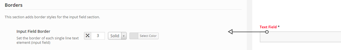
Input Field Border
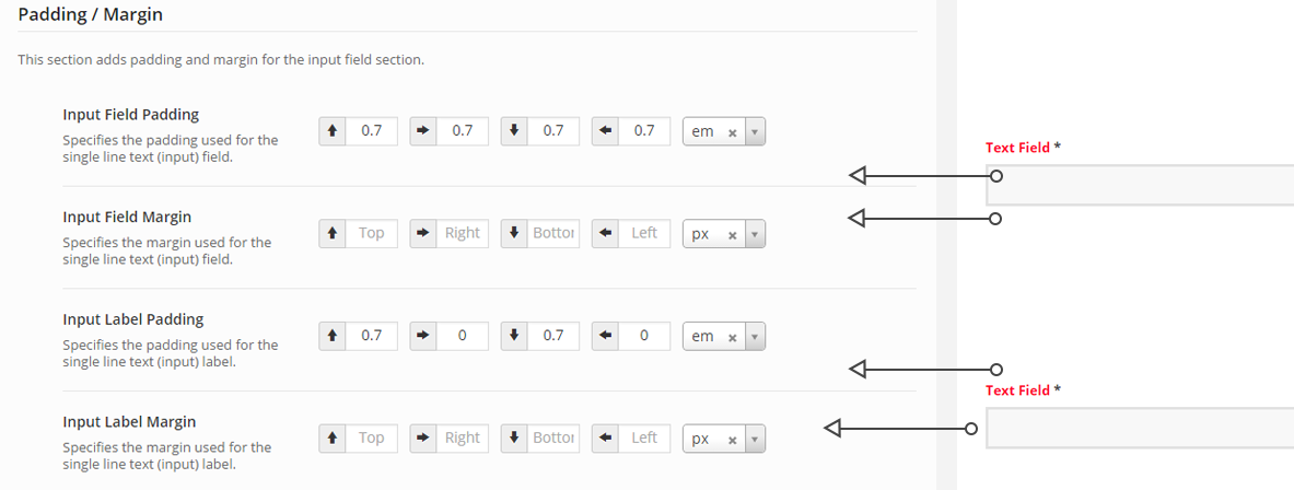
Padding / Margin
Input Field Padding / Margin
Input Field Label Padding / Margin
Fonts & Colours
Input Field Font + Colours
Input Field Label Font + Colours
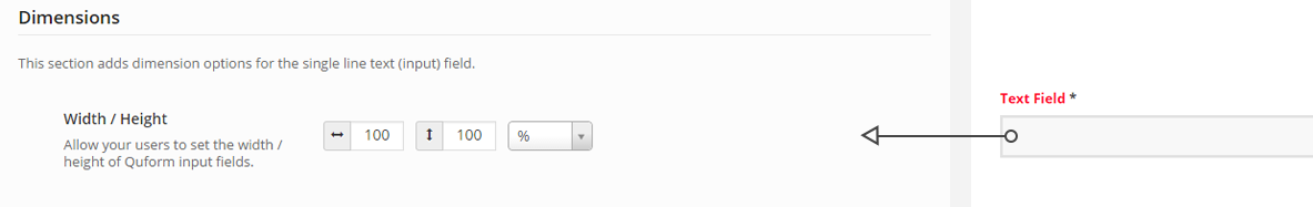
Dimensions
Input Field Width / Height
Input Field Settings: A Detailed Look at What is Possible
Text Field: Padding / Margin
Text Field: Fonts
Text Field: Dimensions
Text Field: Borders
Text Field: Backgrounds
All Fields
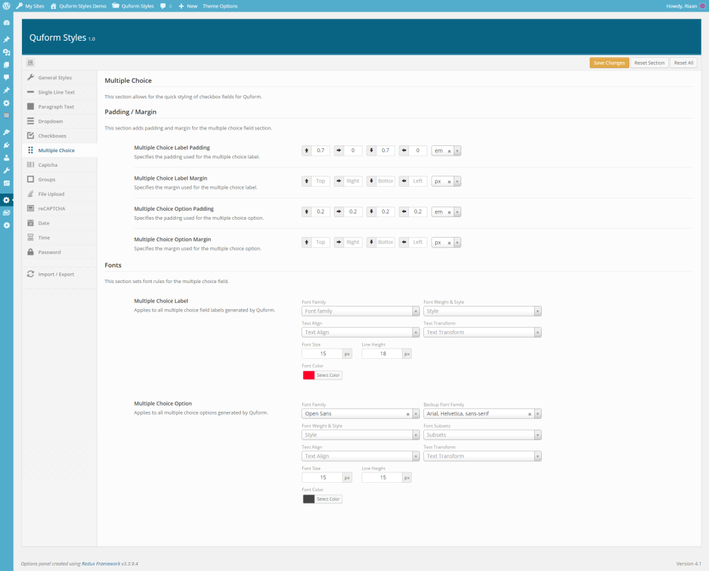
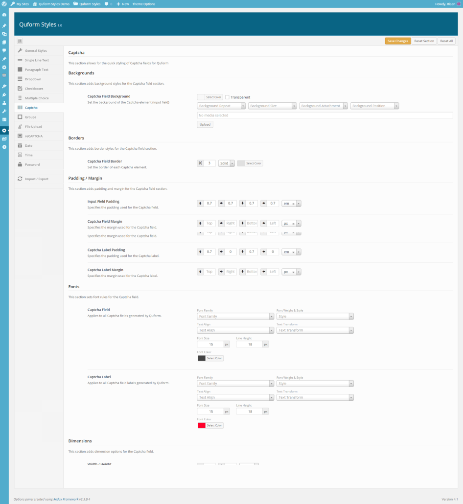
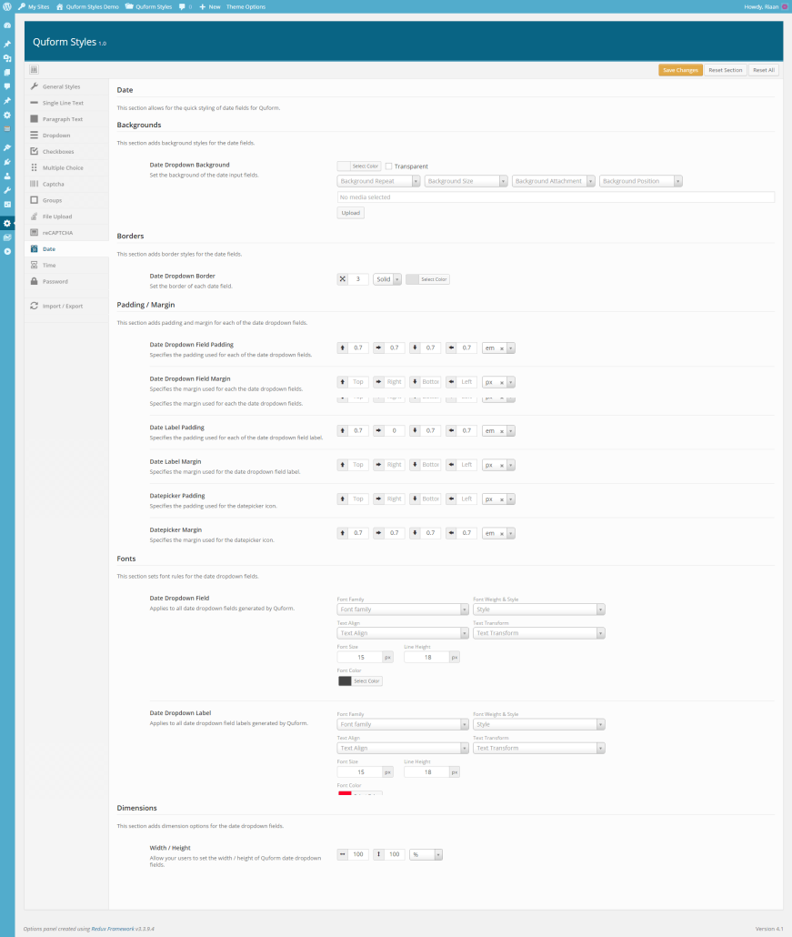
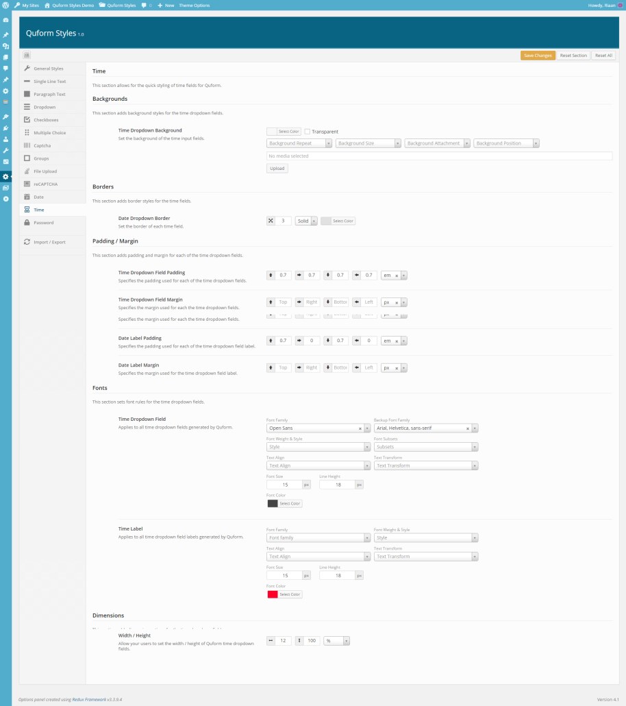
As with the Single Line Text element, Quform Styles has integrated support for all of the fields that comes packaged with Quform. With Quform Styles you’re able to change the default look & feel of the following fields:


